Show the code
pacman::p_load(patchwork, tidyverse, ggstatsplot,
               ggdist, gganimate, png, gifski,plyr, nortest,dplyr,tidyr,lubridate,skimr,ggcorrplot,ggpubr,plotly,
ggiraph, DT,ggridges,viridis,transformr )The local council of a city is in the process of preparing the Local Plan 2023. A sample survey of 1000 representative residents had been conducted to collect data related to their household demographic and spending patterns. The city aims to use the data to assist with their major community revitalization efforts, including how to allocate renewal grant.
This take-home exercise are required to reveal the demographic and financial characteristics of the city by using statistical graphics methods.
pacman::p_load(patchwork, tidyverse, ggstatsplot,
ggdist, gganimate, png, gifski,plyr, nortest,dplyr,tidyr,lubridate,skimr,ggcorrplot,ggpubr,plotly,
ggiraph, DT,ggridges,viridis,transformr )participant <- read_csv("data/Participants.csv")
financial <- read_csv("data/FinancialJournal.csv")Two data sets are provided. They are:
Contains information about the residents of City of Engagement that have agreed to participate in this study.
Change dbl format (household size, age, participant ID) to int (integer) since these values should not be float.
participant <- participant %>%
mutate_at(vars(householdSize,age,participantId), list(~as.integer(.)))
Reorder education level from lowest to highest degree.
participant <- participant %>%
  mutate(educationLevel=factor(educationLevel,levels = c("Low", "HighSchoolOrCollege", "Bachelors", "Graduate")))
data.frame(levels(participant$educationLevel))
levels.participant.educationLevel.
1 Low
2 HighSchoolOrCollege
3 Bachelors
4 GraduateEach column format has been adjusted as below table shown.
head(participant)# A tibble: 6 × 7
participantId householdSize haveKids age educationLevel interestGroup
<int> <int> <lgl> <int> <fct> <chr>
1 0 3 TRUE 36 HighSchoolOrCollege H
2 1 3 TRUE 25 HighSchoolOrCollege B
3 2 3 TRUE 35 HighSchoolOrCollege A
4 3 3 TRUE 21 HighSchoolOrCollege I
5 4 3 TRUE 43 Bachelors H
6 5 3 TRUE 32 HighSchoolOrCollege D
# ℹ 1 more variable: joviality <dbl>Contains information about financial transactions.
Use lubridate package (ymd_hms) to transform timestamp column into datetime format column “time”. Create new columns “Year_Month” and “Year”, since time information is no need for following visual analysis.
financial$time <- as.Date(ymd_hms(financial$timestamp))
financial <- financial %>%
  mutate(Year_Month = format(financial$time, "%Y-%m"),
         Year_Month = factor((Year_Month),levels = unique(Year_Month)),
         Year = format(financial$time, "%Y"),
         participantId = as.integer(participantId))
head(financial)
# A tibble: 6 × 7
participantId timestamp category amount time Year_Month Year
<int> <dttm> <chr> <dbl> <date> <fct> <chr>
1 0 2022-03-01 00:00:00 Wage 2473. 2022-03-01 2022-03 2022
2 0 2022-03-01 00:00:00 Shelter -555. 2022-03-01 2022-03 2022
3 0 2022-03-01 00:00:00 Education -38.0 2022-03-01 2022-03 2022
4 1 2022-03-01 00:00:00 Wage 2047. 2022-03-01 2022-03 2022
5 1 2022-03-01 00:00:00 Shelter -555. 2022-03-01 2022-03 2022
6 1 2022-03-01 00:00:00 Education -38.0 2022-03-01 2022-03 2022 There are some duplicate records with same participant ID, category and timestamp. Use distinct function to drop duplicate rows. The original amount column contains positive(meaning income) and negative (expense) values. Transform amount to absolute value to avoid confusion.
detach(package:plyr)
library(dplyr)
financial_new <-
  financial %>%
  distinct(participantId, category, timestamp,.keep_all = TRUE) %>%
  group_by(participantId, category, Year,Year_Month) %>%
  summarise(amount = round(sum(abs(amount)),1), .groups = 'drop')

head(financial_new)
# A tibble: 6 × 5
participantId category Year Year_Month amount
<int> <chr> <chr> <fct> <dbl>
1 0 Education 2022 2022-03 38
2 0 Education 2022 2022-04 38
3 0 Education 2022 2022-05 38
4 0 Education 2022 2022-06 38
5 0 Education 2022 2022-07 38
6 0 Education 2022 2022-08 38To compare amount of different categories, need to split out the unique values in the “category” column and their corresponding amounts into new columns by pivot_wider function. Fill null values with 0.
financial_orginize <- financial_new %>%
  pivot_wider(names_from = category, values_from = amount, values_fill = 0) %>%
  mutate(Total_Expense=rowSums(select(.,Education,Food,Recreation,Shelter)))

head(financial_orginize)
# A tibble: 6 × 10
participantId Year Year_Month Education Food Recreation Shelter Wage
<int> <chr> <fct> <dbl> <dbl> <dbl> <dbl> <dbl>
1 0 2022 2022-03 38 268. 349. 555 11932.
2 0 2022 2022-04 38 266. 219. 555 8637.
3 0 2022 2022-05 38 265. 383 555 9048.
4 0 2022 2022-06 38 257 466. 555 9048.
5 0 2022 2022-07 38 270. 1070. 555 8637.
6 0 2022 2022-08 38 262. 314. 555 9459.
# ℹ 2 more variables: RentAdjustment <dbl>, Total_Expense <dbl>Some participants only have 1-month records, so remain participants’ records with 12 months, and calculate their monthly average wage and spending in the “financial_average” data frame.
financial_average <- financial_orginize %>%
  group_by(participantId) %>%
  summarise(across(Education:Total_Expense,sum),
            Month_count = n_distinct(Year_Month),
            .groups = 'drop') %>%
  filter(Month_count == 12) %>%
  mutate(across(Education:Total_Expense, ~round(. / Month_count, 1)))
Join with “participant” by the same participant ID.
df_average <-  merge(x=financial_average,y=participant,by="participantId")

DT::datatable(df_average)To better understand the correlation between joviality, annual income and spending, comparing the Pearson correlation values. Major findings as follow:
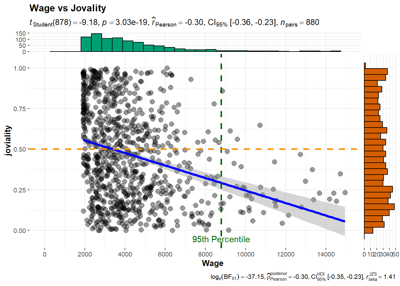
Higher income does not necessarily lead to higher joviality
With closer examination of the correlation scatter plots, can find that there are participants with extremely high wage. While the majority of participants with wages below the 95th percentile exhibit a wide range of joviality values, those in the top 5th percentile of wage earners tend to have joviality values below 0.5.
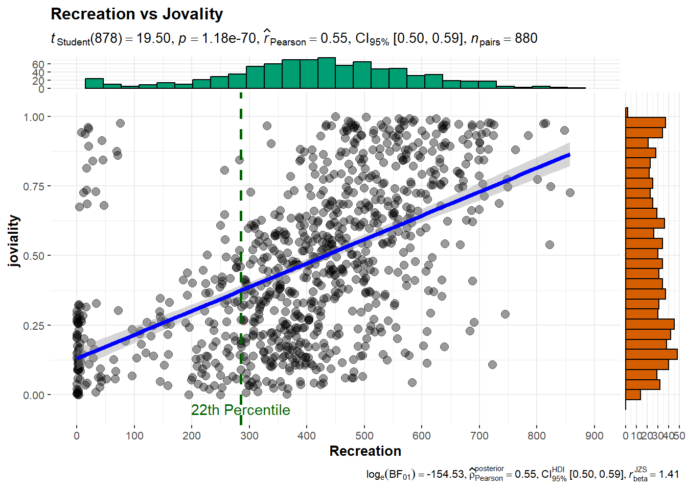
Joviality is most correlated with recreation spending.
For participants with spending above the 22th percentile, can observe a positive correlation between spending on recreation and joviality. This suggests that for those who spend more on recreation activities, there is a tendency to experience higher levels of joviality.
ggstatsplot::ggcorrmat(
  data = df_average,
  cor.vars = c("Wage","joviality","Recreation","Food","Shelter"))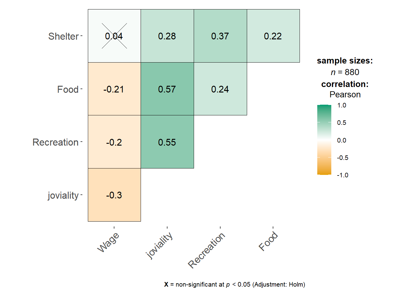
ggscatterstats(
  data = df_average,
  x = Wage,
  y = joviality,
  title = 'Wage vs Jovality',
  ggplot.component = list(
    scale_x_continuous(
      breaks = seq(0, 15000, 2000),
      limits = c(0, 15000)
    )
  )
) +
  geom_vline(aes(xintercept = quantile(Wage,probs=0.95)), color = "darkgreen",linetype="dashed",linewidth=1)+
  geom_hline(aes(yintercept = 0.5), color = "darkorange",linetype="dashed",linewidth=1)+
  annotate(
    "text",
    x = quantile(df_average$Wage, probs = 0.95),
    y = -0.05,
    label = "95th Percentile",
    color = "darkgreen"
  )
ggscatterstats(
  data = df_average,
  x = Recreation,
  y = joviality,
  title = 'Recreation vs Jovality',
  ggplot.component = list(
    scale_x_continuous(
      breaks = seq(0, 900, 100),
      limits = c(0, 900)
    )
  )
) +
  geom_vline(aes(xintercept = quantile(Recreation,probs=0.22)), color = "darkgreen",linetype="dashed",linewidth=1)+
  #geom_hline(aes(yintercept = 0.5), color = "darkorange",linetype="dashed",linewidth=1)+
  annotate(
    "text",
    x = quantile(df_average$Recreation, probs = 0.22),
    y = -0.05,
    label = "22th Percentile",
    color = "darkgreen"
  )
bs <- ungeviz::bootstrapper(20)


ggplot(df_average, aes(Recreation, joviality)) +
  geom_smooth(method = "lm", color = NA) +
  geom_point(alpha = 0.3) +
  geom_point(data = bs, aes(group = .row)) +
  geom_smooth(data = bs, method = "lm", fullrange = TRUE, se = FALSE) +
  theme_bw() +
  transition_states(.draw, 1, 1) +
  enter_fade() +
  exit_fade()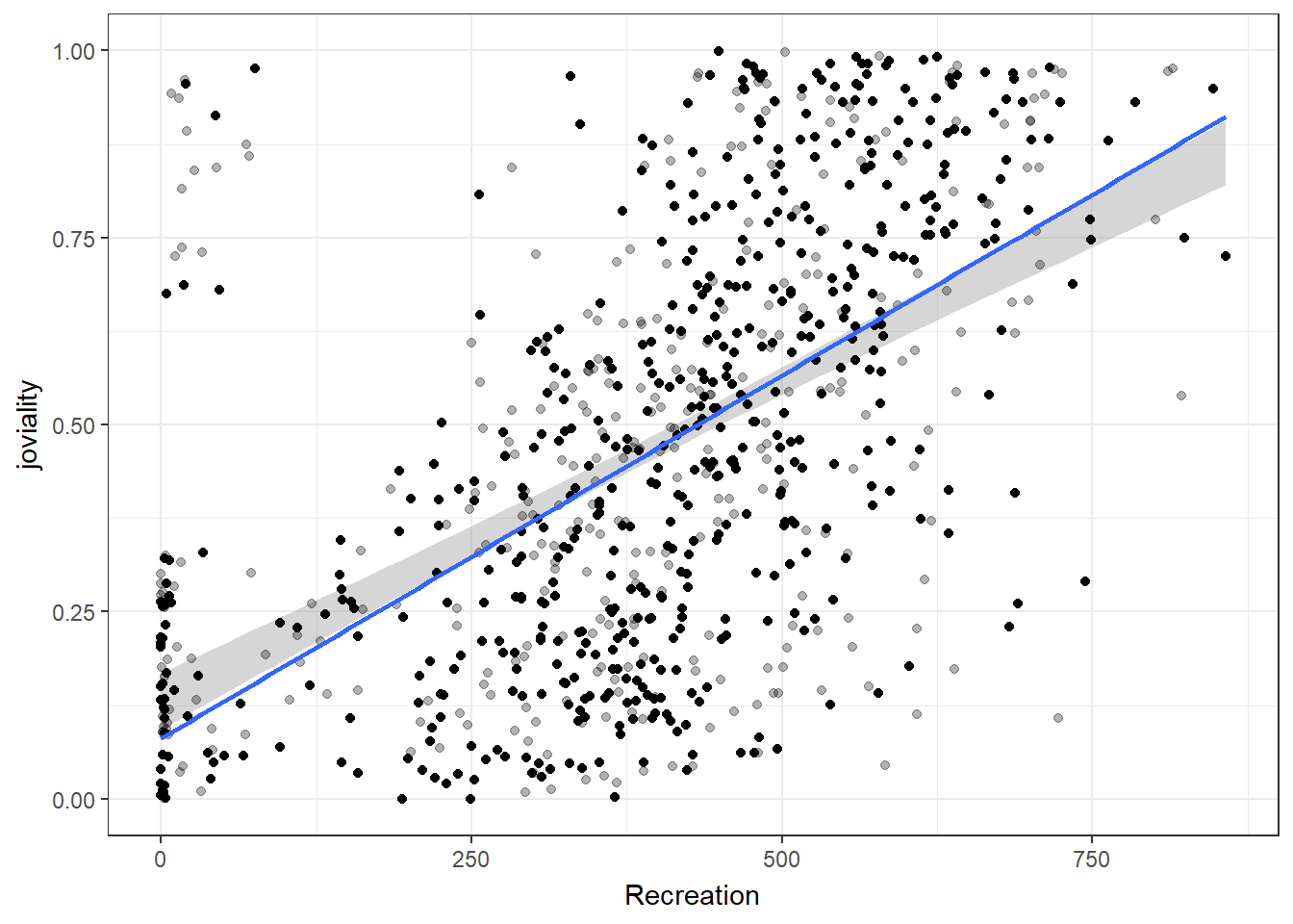
bs <- ungeviz::bootstrapper(20)


ggplot(df_average, aes(Wage, joviality)) +
  geom_smooth(method = "lm", color = NA) +
  geom_point(alpha = 0.3) +
  geom_point(data = bs, aes(group = .row)) +
  geom_smooth(data = bs, method = "lm", fullrange = TRUE, se = FALSE) +
  theme_bw() +
  transition_states(.draw, 1, 1) +
  enter_fade() +
  exit_fade()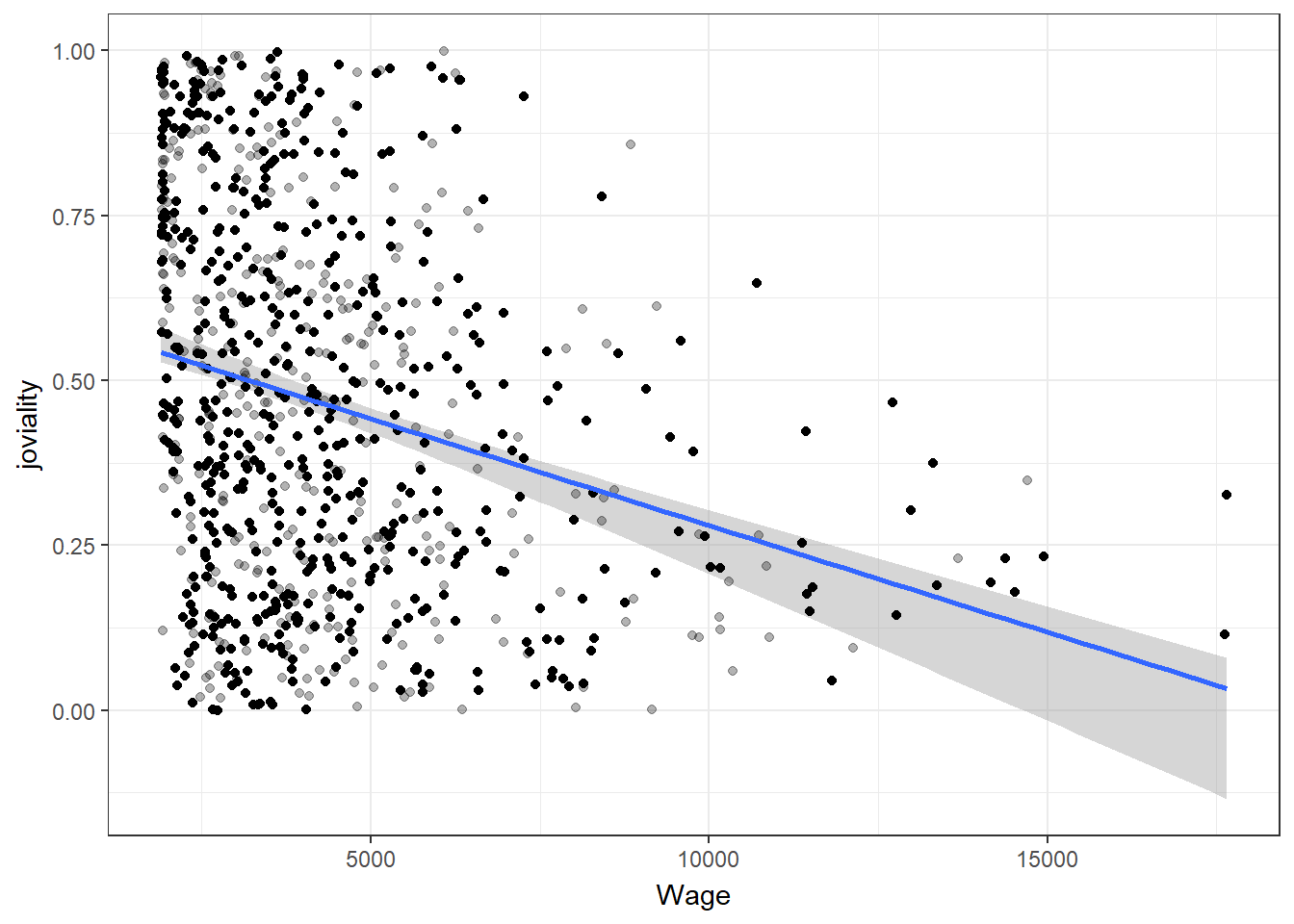
Since each category has a different value range, applying scale of log10 to make the ranges comparable in the same graph. Education expense has the lowest average value, while recreation expense exhibits a larger variance, and food expense is more centered.
# Reshape the data from wide to long format using pivot_longer
p <- df_average %>%
  group_by(participantId) %>%
  summarise(across(Education:Wage),
            .groups = 'drop') %>%
  pivot_longer(cols = -participantId, names_to = "Category", values_to = "Value")

plot <- ggplot(p,aes(x = Value, fill = Category)) +
  geom_density_interactive(aes(tooltip=Category),alpha=0.8) +
# Generate a discrete version from the "viridis" color palette to make the colors more beautiful
  scale_fill_viridis_d(option = "D")+
  scale_y_continuous(NULL,
                     breaks = NULL)+
  ggtitle("Financial transaction distribution")+
  scale_x_log10()

# Create girafe interactive label to easily identify each density category
girafe(
  ggobj = plot,
  width_svg = 6,
  height_svg = 6 * 0.618
)
Upon closer examination of the expenses in the following categories, food and recreation have similar mean values, while recreation exhibits a larger spread of spending amounts. And shelter expense demonstrates the highest number of outliers.
# Use same color from previous plot for the same category
color_palette <- viridis_pal(option = "D")(5)
selected_colors <- color_palette[2:4]

p1 <- df_average %>%
  group_by(participantId) %>%
  summarise(across(Food:Shelter),
            .groups = 'drop') %>%
  pivot_longer(cols = -participantId, names_to = "Category",
               values_to = "Value") %>%
  ggplot(aes(y = Value, x = Category, fill = Category)) +
  geom_boxplot() +
  scale_fill_manual(values = selected_colors)+
  stat_summary(geom = "point",
               fun = "mean",
               color = "black",
               size = 4) +
  labs(x = "Spending category", y = "Amount") +
  theme(legend.position = "none")

ggplotly(p1)To assess the standard error of spending and wage amounts, use z-score normalization to standardize the range. Wage exhibits the largest range of error bars, suggesting a significant level of variability and uncertainty surrounding the wage data from these participants.
p <- df_average %>%
  group_by(participantId) %>%
  summarise(across(Education:Wage),
            .groups = 'drop')
# Select all columns except for participant id, and apply mean/sd calculation to all selected columns
means <- apply(p[, -1], 2, mean)
std_errors <- apply(p[, -1], 2, function(x) sd(x) / sqrt(length(x)-1))

# Create a new dataframe with means and standard errors by category
plot_df <- data.frame(
  variable = names(means),
  mean = means,
  se = std_errors
)

plot_df <- rownames_to_column(plot_df, var = "row_index") %>%
  select(-row_index)

knitr::kable(head(plot_df), format = 'html')| variable | mean | se |
|---|---|---|
| Education | 12.97739 | 0.8707907 |
| Food | 349.97352 | 2.6425127 |
| Recreation | 392.36182 | 6.2265815 |
| Shelter | 639.79523 | 7.2402118 |
| Wage | 4286.32250 | 77.6725270 |
plot_df$normalized_mean <- scale(plot_df$mean)

ggplot(plot_df) +
  geom_errorbar_interactive(aes(x=variable,ymin = normalized_mean - se, ymax = normalized_mean + se), width = 0.2) +
  geom_point(aes
           (x=variable,y=normalized_mean),
           stat="identity",
           color="red",
           size = 1.5,
           alpha=1)+
labs(title = "Normalized Mean and Standard Error", x = "Variable", y = "Mean") 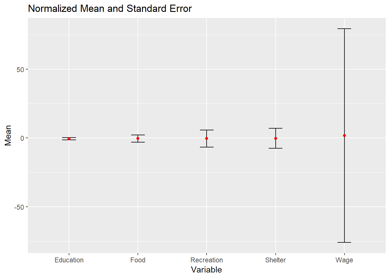
30% of participants have kids, indicating a difference in family composition. Those without children do not have education expense. Besides, participants with kids tend to have higher average expenses in the shelter category.
# Calculate average amount based on number of participants having/not having kids
summary_kid <- df_average %>%
  group_by(haveKids) %>%
  summarise(across(Education:RentAdjustment,sum),
            persons = n_distinct(participantId),
            .groups = 'drop') %>%
  mutate(across(Education:RentAdjustment, ~round(. / persons, 1)))

# Reshape the data from wide to long format
melted_kid <- gather(summary_kid, key = "Category", value = "Value", -haveKids)
melted_kid <- melted_kid %>% filter(Category != "persons",Category
                                    !="RentAdjustment",Category != "Wage")

head(melted_kid)
# A tibble: 6 × 3
haveKids Category Value
<lgl> <chr> <dbl>
1 FALSE Education 0
2 TRUE Education 46.2
3 FALSE Food 350.
4 TRUE Food 350.
5 FALSE Recreation 379.
6 TRUE Recreation 428. prop1 <- ggplot(data = df_average, aes(x = haveKids, fill = haveKids)) +
geom_bar(color = "black", size = 0.5) +
geom_text(stat = "count",
aes(label = paste0("(", count, ") ", round(..count../sum(..count..) * 100, 1), "%")),vjust = -1, color = "black") +
labs(title = "Number of Participants with/without Kids",x="",
fill = "Have Kids") +
ylab("Count") +
coord_cartesian(ylim = c(0, 850)) +
theme_minimal() +
theme(
plot.title = element_text(hjust = 0.4, size = 15, face = "bold"),
plot.margin = margin(20, 20, 20, 20),
legend.position = "right",
legend.text = element_text(size = 12),
legend.title = element_text(size = 14, face = "bold"),
axis.title.x = element_text(size = 12),
axis.title.y = element_text(size = 12),
axis.text.x = element_text(size = 12),
axis.text.y = element_text(size = 12),
panel.grid.major = element_blank(),
panel.grid.minor = element_blank()
)
# Code to generate `prop2`
prop2 <- ggplot(melted_kid, aes(Category, Value, fill = haveKids)) +
geom_bar(stat = "identity", position = "dodge", color = "black", size = 0.5) +
labs(title = "Average Spending Pattern", x = NULL) +
ylab("Amount") +
coord_cartesian(ylim = c(0, 850))+
theme_minimal() +
theme(
plot.title = element_text(hjust = 0.4, size = 15, face = "bold"),
plot.margin = margin(20, 20, 20, 20),
legend.position = "None",
legend.text = element_text(size = 12),
legend.title = element_text(size = 14, face = "bold"),
axis.title.x = element_text(size = 12),
axis.title.y = element_text(size = 12),
axis.text.x = element_text(size = 12),
axis.text.y = element_text(size = 12),
panel.grid.major = element_blank(),
panel.grid.minor = element_blank()
)
prop1 / prop2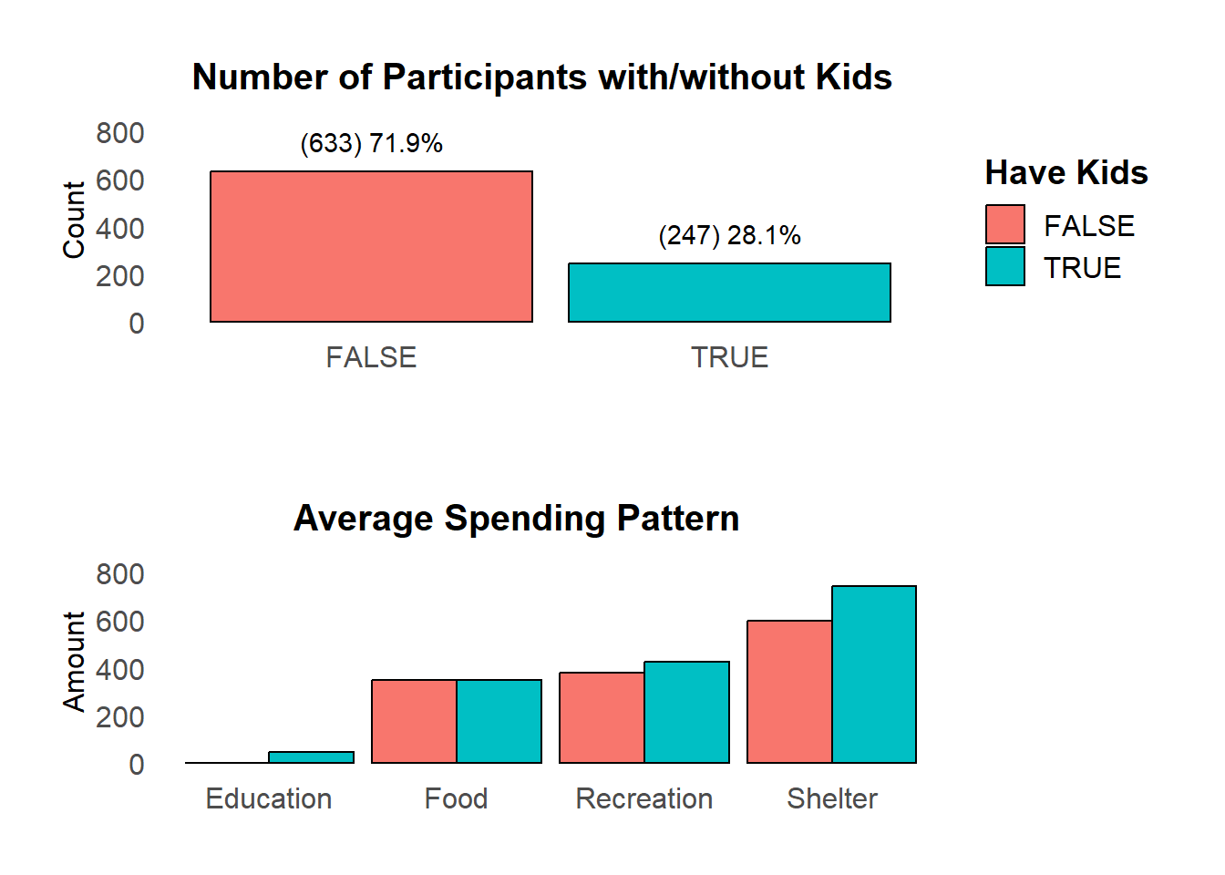
Individuals with children tend to have higher wages, while those without children typically have wages centered around lower values.
#Calculate mean wage of groups have/not having kids
library(plyr)
mukid <- ddply(df_average, "haveKids", summarise, kid.mean=mean(Wage))

p<-ggplot(df_average, aes(x=Wage,fill=haveKids))+
  geom_density(alpha=0.5)+
  scale_y_continuous(NULL, breaks = NULL) +
  labs(title="Wage with/without kids",x="Wage amount")+
  theme(plot.margin = margin(50, 50, 20, 20),
        legend.position = "None",
         plot.title = element_text(hjust = 0.4, size = 15, face = "bold")
       )+
  facet_grid(haveKids ~ .)

# Add mean lines
p+geom_vline(data=mukid, aes(xintercept=kid.mean, color="red"),
             linetype="dashed")+
  geom_text(data = mukid, aes(x = kid.mean, label = "mean"),
            color = "black", y=0,vjust = -1, hjust = -0.5)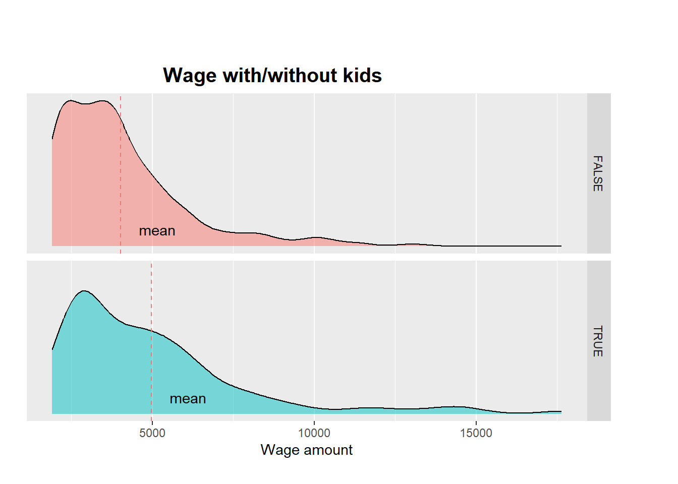
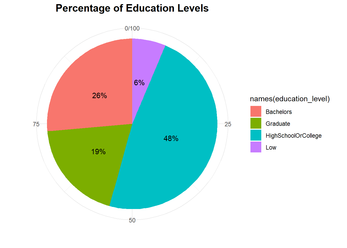
Majority of participants have completed high school or college as their highest level of education
# Count percentage of different education level in all participants
education_level <- prop.table(table(df_average$educationLevel)) * 100

ggplot(data = data.frame(education_level), aes(x = "", y = education_level,
                                               fill=names(education_level)),
                                                 ) +
  geom_bar(width = 1, stat = "identity") +
  coord_polar(theta = "y") +
   geom_text(aes(label = paste0(round(education_level, 0), "% ")),
             position = position_stack(vjust = 0.5)) +
  labs(title = "Percentage of Education Levels") +
  labs(title = "Percentage of Education Levels",x="",y="") +
  theme_minimal() +
  theme(
    plot.title = element_text(hjust = 0.5, size = 15, face = "bold")
  )
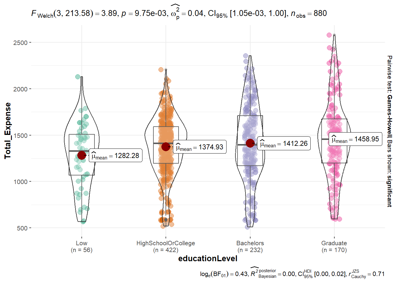
Based on the ANOVA test graph, it is apparent that there is a significant difference in the average total expense among participants with different education levels wtih p value smaller than 0.05. However, when conducting pairwise comparisons between the different total expense amounts, there is no significant difference observed.
ggbetweenstats(
  data = df_average,
  x = educationLevel,
  y = Total_Expense,
  pairwise.comparisons = TRUE,
  pairwise.display = "s",
  p.adjust.method = "fdr",
  messages = FALSE
)
When comparing the distribution of wage, can see that graduate group has the highest income, while high school/college and people with low education have income lower than overall income mean.
ggplot(data = df_average, aes(x = Wage,y= educationLevel,fill = factor(stat(quantile))
           ))+
  stat_density_ridges(
    geom = "density_ridges_gradient",
    calc_ecdf = TRUE,
    quantiles = 4,
    quantile_lines = TRUE,
    jittered_points = TRUE) +

  scale_fill_viridis_d(name = "Quartiles")+
  theme_ridges()+
  theme(plot.margin = margin(50, 50, 20, 20),
        legend.position = "None"
       )+
  ylab(" ")+
  ggtitle("Wage of Different education level")+
  geom_vline(aes(xintercept=mean(Wage)),
             color="black",
             size=2)+
  annotate("text", x = mean(df_average$Wage),
           y = 0, label = "Overall    Mean", color = "black", vjust = 0)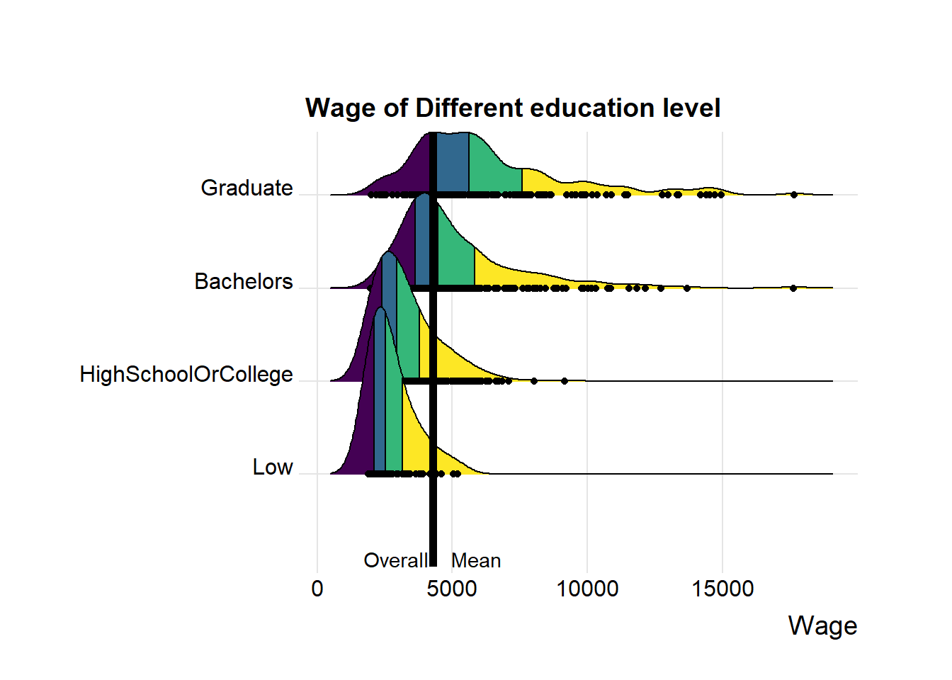
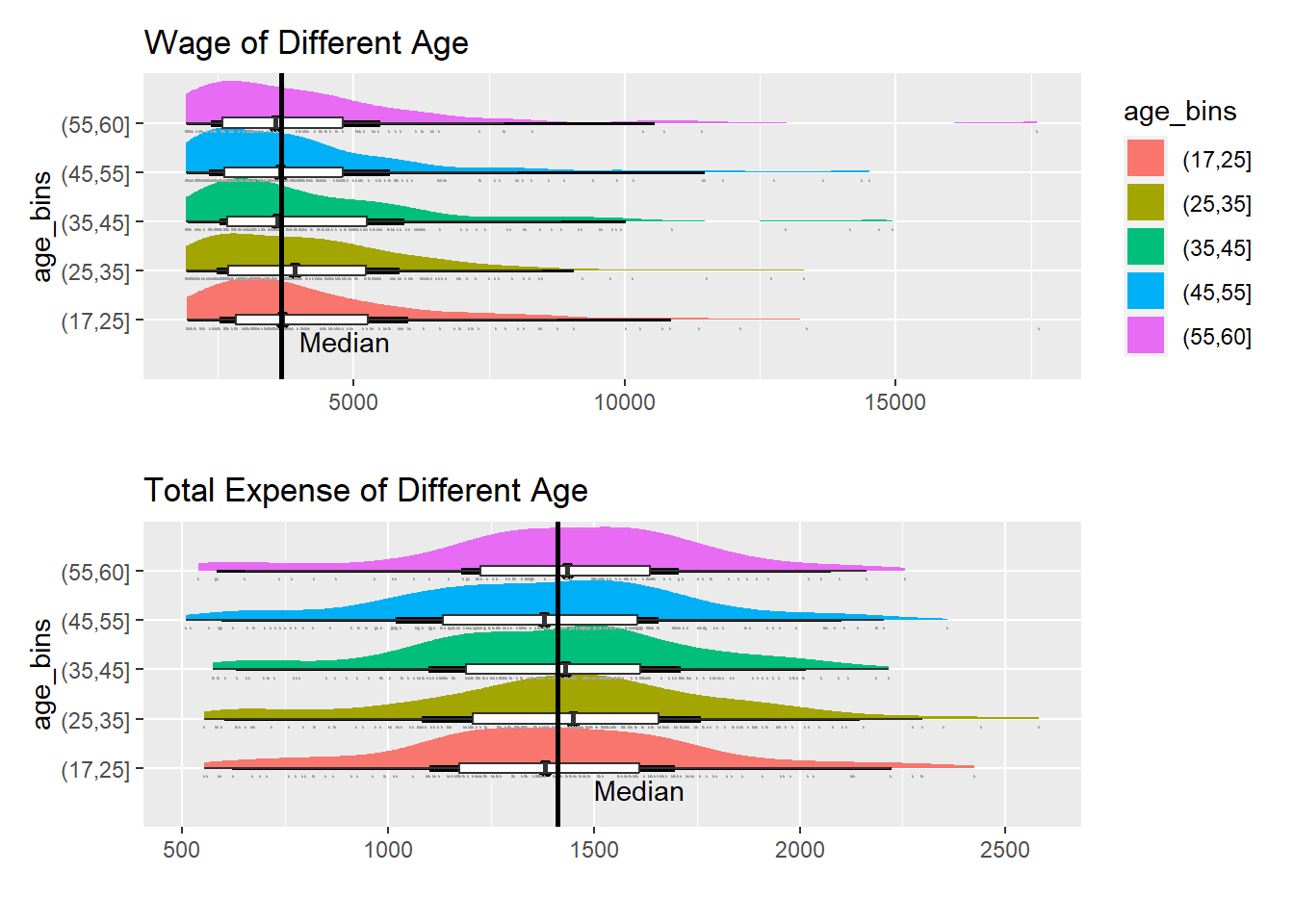
By categorizing participants into different age groups and comparing their total expenses and wages, observe that the differences among age groups are relatively small. This suggests that age may not be a significant factor influencing financial habits.
df_age <- df_average %>%
  mutate(age_bins =
           cut(age,
               breaks = c(17,25,35,45,55,60))
)

knitr::kable(head(df_age), format = 'html')| participantId | Education | Food | Recreation | Shelter | Wage | RentAdjustment | Total_Expense | Month_count | householdSize | haveKids | age | educationLevel | interestGroup | joviality | age_bins |
|---|---|---|---|---|---|---|---|---|---|---|---|---|---|---|---|
| 0 | 38.0 | 261.8 | 365.3 | 555.0 | 9151.4 | 0.0 | 1220.1 | 12 | 3 | TRUE | 36 | HighSchoolOrCollege | H | 0.0016267 | (35,45] |
| 1 | 38.0 | 263.9 | 553.1 | 555.0 | 8031.3 | 0.0 | 1410.1 | 12 | 3 | TRUE | 25 | HighSchoolOrCollege | B | 0.3280865 | (17,25] |
| 2 | 12.8 | 288.9 | 347.7 | 556.6 | 7092.3 | 0.0 | 1206.0 | 12 | 3 | TRUE | 35 | HighSchoolOrCollege | A | 0.3934696 | (25,35] |
| 3 | 38.0 | 283.0 | 392.0 | 555.0 | 6855.8 | 0.0 | 1268.0 | 12 | 3 | TRUE | 21 | HighSchoolOrCollege | I | 0.1380634 | (17,25] |
| 4 | 12.8 | 271.8 | 526.3 | 1404.5 | 8837.9 | 400.8 | 2215.5 | 12 | 3 | TRUE | 43 | Bachelors | H | 0.8573967 | (35,45] |
| 5 | 12.8 | 345.4 | 428.3 | 600.0 | 1934.1 | 0.0 | 1386.5 | 12 | 3 | TRUE | 32 | HighSchoolOrCollege | D | 0.7729578 | (25,35] |
p1 <- ggplot(df_age,
       aes(x = age_bins,
           y = Wage)) +
  stat_halfeye(aes(fill=age_bins)) +
  geom_boxplot(width = .20,
               outlier.shape = NA) +
  stat_dots(side = "left",
            justification = 1.2,
            binwidth = .5,
            dotsize = 1.5) +
  coord_flip()+
  ylab(" ")+
  ggtitle("Wage of Different Age")+
  geom_hline(aes(yintercept=median(Wage)),
             color="black",
             size=1)+
  annotate("text", x = min(as.numeric(df_age$age_bins)), y = 4000,
           label = "Median", vjust = 1.5, hjust = 0)

p2 <- ggplot(df_age,
       aes(x = age_bins,
           y = Total_Expense)) +
  stat_halfeye(aes(fill=age_bins)) +
  geom_boxplot(width = .20,
               outlier.shape = NA) +
  stat_dots(side = "left",
            justification = 1.2,
            binwidth = .5,
            dotsize = 1.5) +
  coord_flip()+
  ylab(" ")+
  ggtitle("Total Expense of Different Age")+
  geom_hline(aes(yintercept=median(Total_Expense)),
             color="black",
             size=1)+
  theme(legend.position = "None")+
  annotate("text", x = min(as.numeric(df_age$age_bins)), y = 1500,
           label = "Median", vjust = 1.5, hjust = 0)

p1/p2