pacman::p_load(tidyverse, plotly, crosstalk, DT, ggdist, gganimate,ggstatsplot,readxl, performance, parameters, see)Hands-on_Ex04
Visual Statistical Analysis with ggstatsplot
Import package and data
library(readr)
exam_data <- read_csv("data/Exam_data.csv")
One sample test graph
set.seed(1234)
gghistostats(data=exam_data,x=ENGLISH, type="bayes",
             test.values=70,xlab="English score")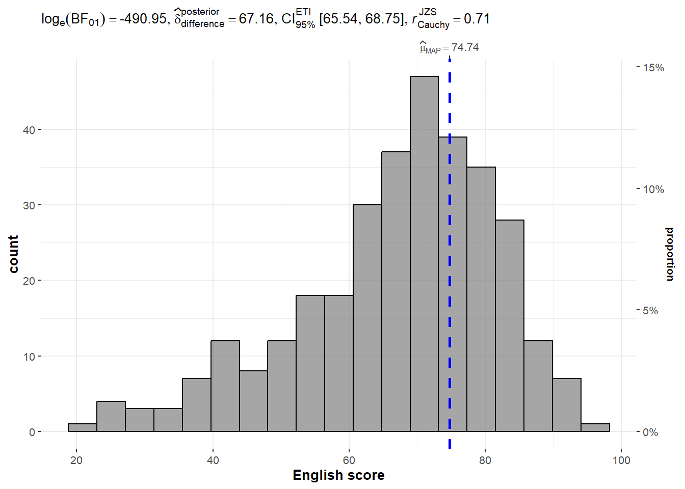
Two sample mean test
Compare distribution/density of female and male performance in Math test
ggbetweenstats(
  data=exam_data,
  x=GENDER,
  y=MATHS,
  type='np',
  message=FALSE)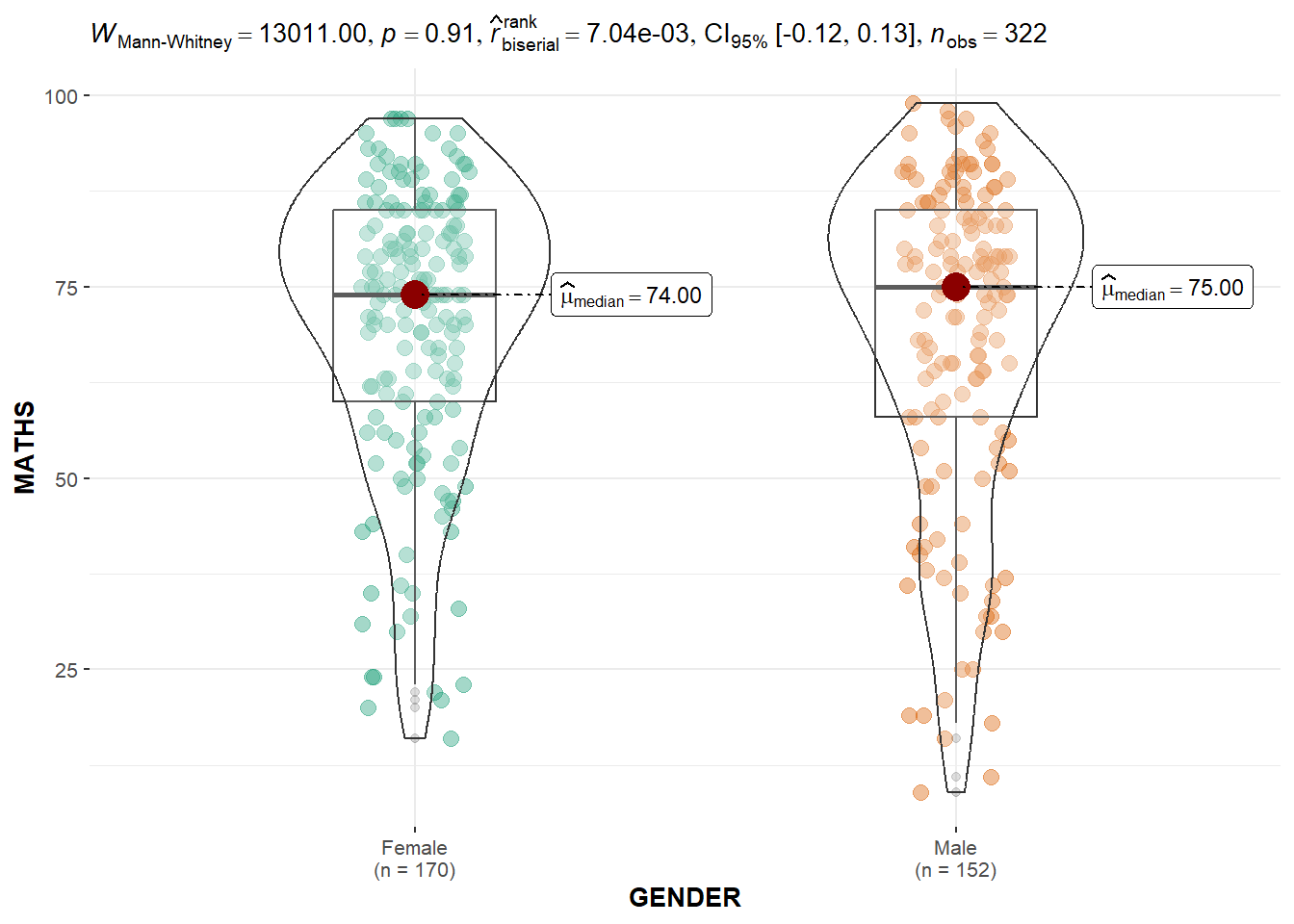
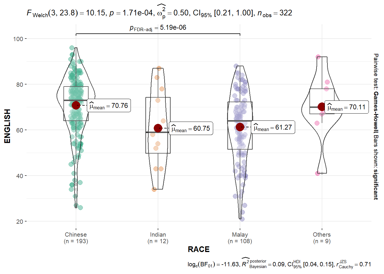
One way ANOVA test
ggbetweenstats(data=exam_data,
               x=RACE,
               y=ENGLISH,
               type='p',
               mean.ci=TRUE,
               pairwise.comparisons = TRUE,
               pairwise.display = 's',
               p.adjust.method = 'fdr',
               message=FALSE
               )
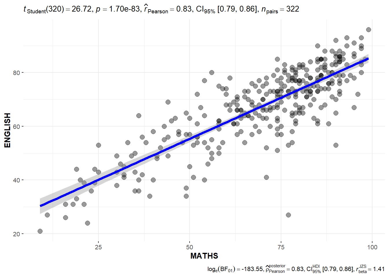
Correlatin test
Can see Pearson correlation coefficient
ggscatterstats(data=exam_data,
               x=MATHS,
               y=ENGLISH,
               marginal = FALSE
               )
Significant Test of Association
exam=exam_data %>%
  mutate(MATHS_bins=
           cut(MATHS,
               breaks=c(0,60,75,85,100)))

ggbarstats(data=exam,
           x=MATHS_bins,
           y=GENDER)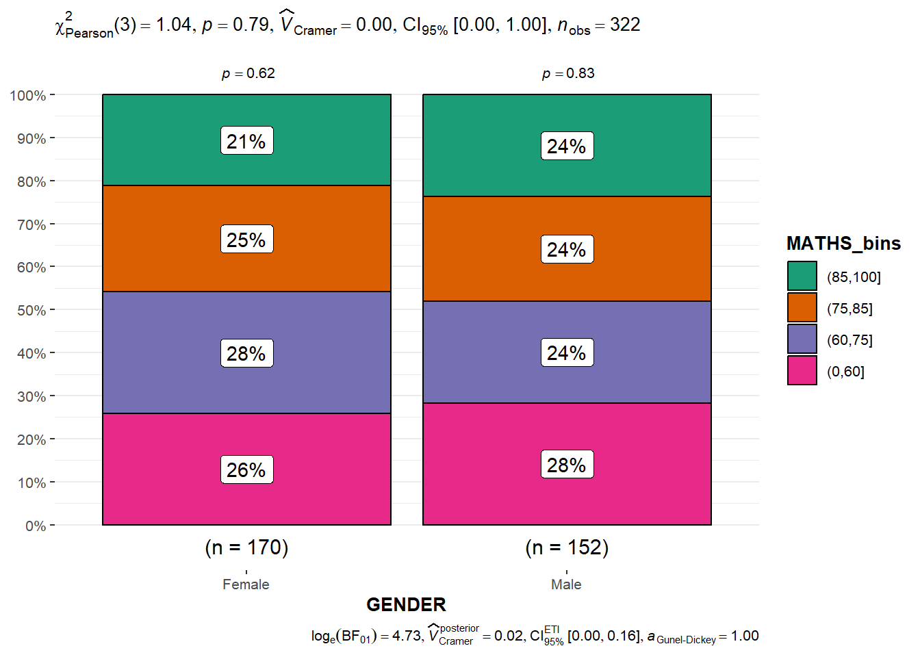
Toyota Corolla case with linear regression
Import the data
resale_car <- read_xls("data/ToyotaCorolla.xls",
                       "data")
colnames(resale_car)
[1] "Id" "Model" "Price" "Age_08_04"
[5] "Mfg_Month" "Mfg_Year" "KM" "Quarterly_Tax"
[9] "Weight" "Guarantee_Period" "HP_Bin" "CC_bin"
[13] "Doors" "Gears" "Cylinders" "Fuel_Type"
[17] "Color" "Met_Color" "Automatic" "Mfr_Guarantee"
[21] "BOVAG_Guarantee" "ABS" "Airbag_1" "Airbag_2"
[25] "Airco" "Automatic_airco" "Boardcomputer" "CD_Player"
[29] "Central_Lock" "Powered_Windows" "Power_Steering" "Radio"
[33] "Mistlamps" "Sport_Model" "Backseat_Divider" "Metallic_Rim"
[37] "Radio_cassette" "Tow_Bar" Build multiple linear regression
model <- lm(Price ~ Age_08_04 + Mfg_Year + KM +
              Weight + Guarantee_Period, data = resale_car)
model
Call:
lm(formula = Price ~ Age_08_04 + Mfg_Year + KM + Weight + Guarantee_Period,
    data = resale_car)

Coefficients:
     (Intercept)         Age_08_04          Mfg_Year                KM
      -2.637e+06        -1.409e+01         1.315e+03        -2.323e-02
          Weight  Guarantee_Period
       1.903e+01         2.770e+01
Check multicollinearity
One way to detect multicollinearity (whether independent variables are highly correlated) is to calculate the variance inflation factor (VIF) for each independent variable.
c <- check_collinearity(model)
plot(c)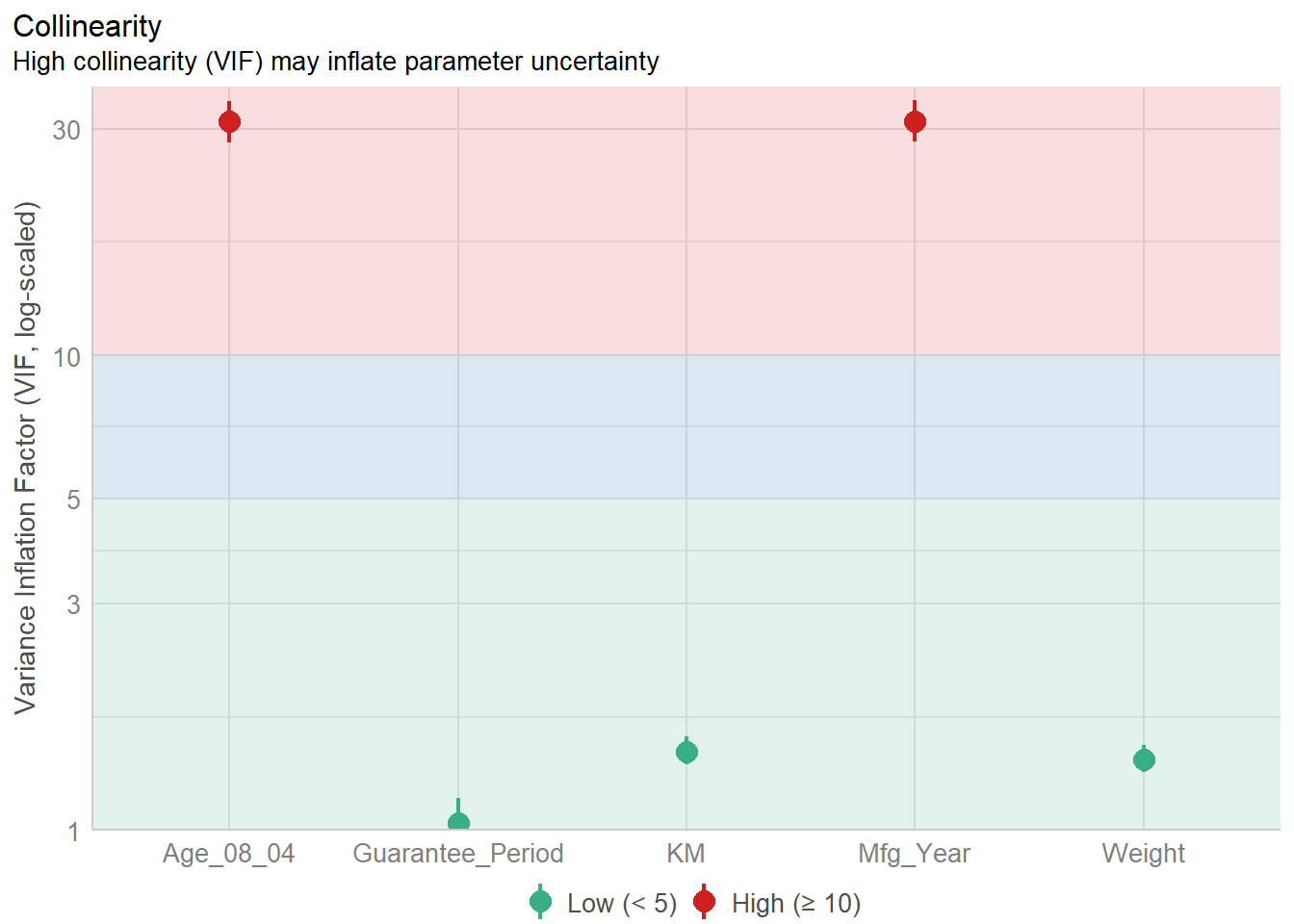
Checking normality assumption
Build model1(remove one highly correlated variable of mfg_year)
model1 <- lm(Price ~ Age_08_04 + KM +
              Weight + Guarantee_Period, data = resale_car)
check_n <- check_normality(model1)
plot(check_n)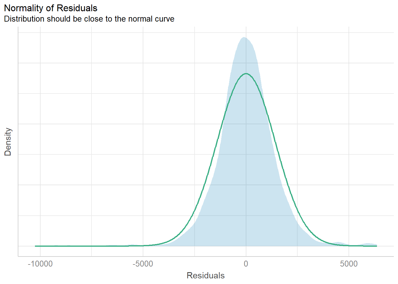
Check model for homogeneity of variances
Significance testing for linear regression models assumes that the model errors (or residuals) have constant variance.
check_v <- check_heteroscedasticity(model1)
plot(check_v)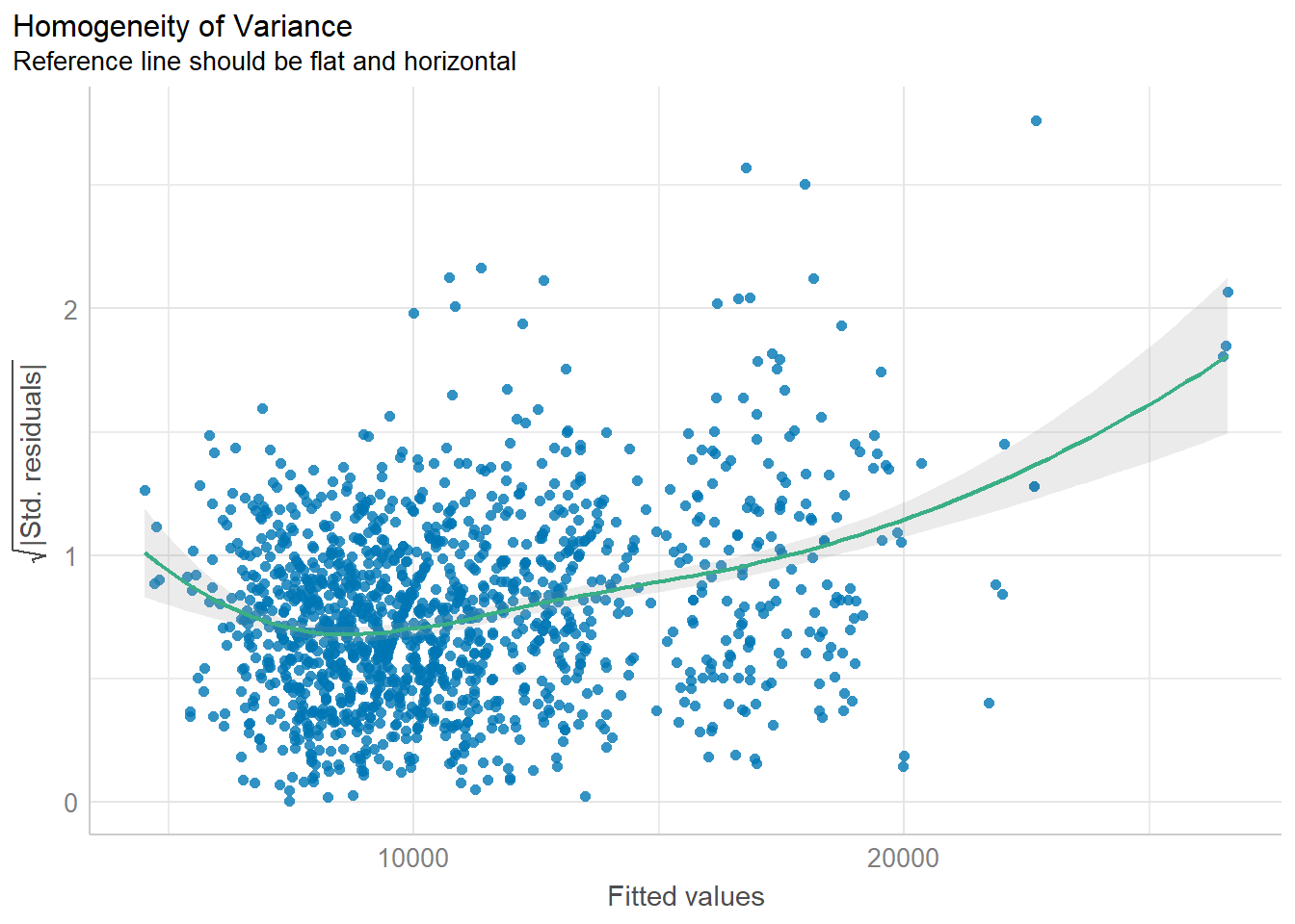
Complete check
Can also check all the assumptions by one step. Influential observation is an observation in a dataset that, when removed, dramatically changes the coefficient estimates of a regression model
check_model(model1)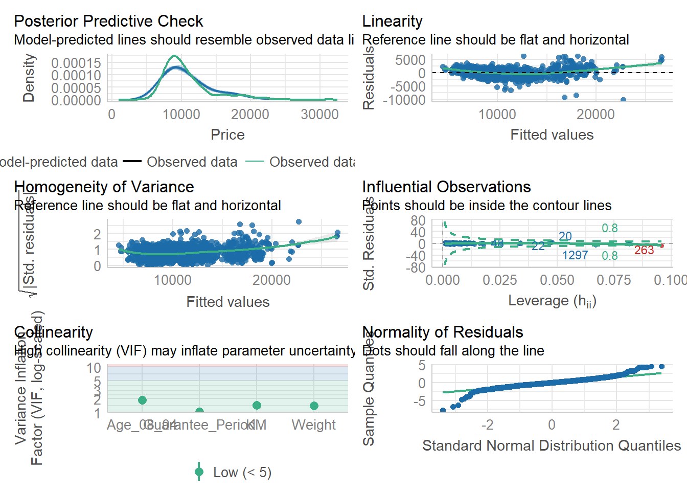
Parameter plot
See the coefficient direction and strength in the plot.
plot(parameters(model1))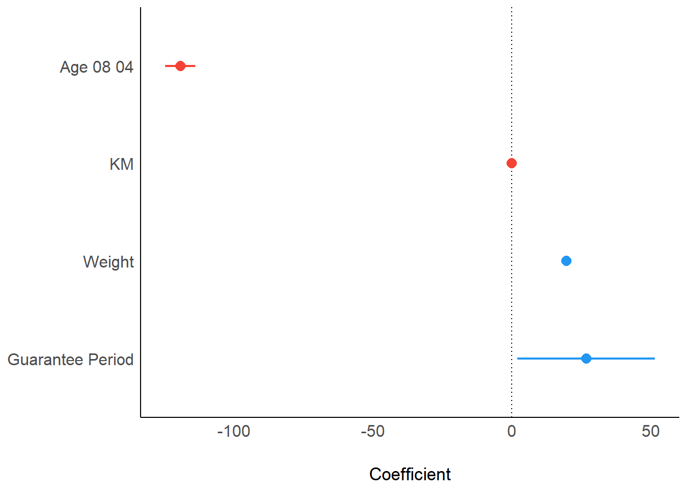
Visualising Regression Parameters
ggcoefstats(model1,
            output = "plot")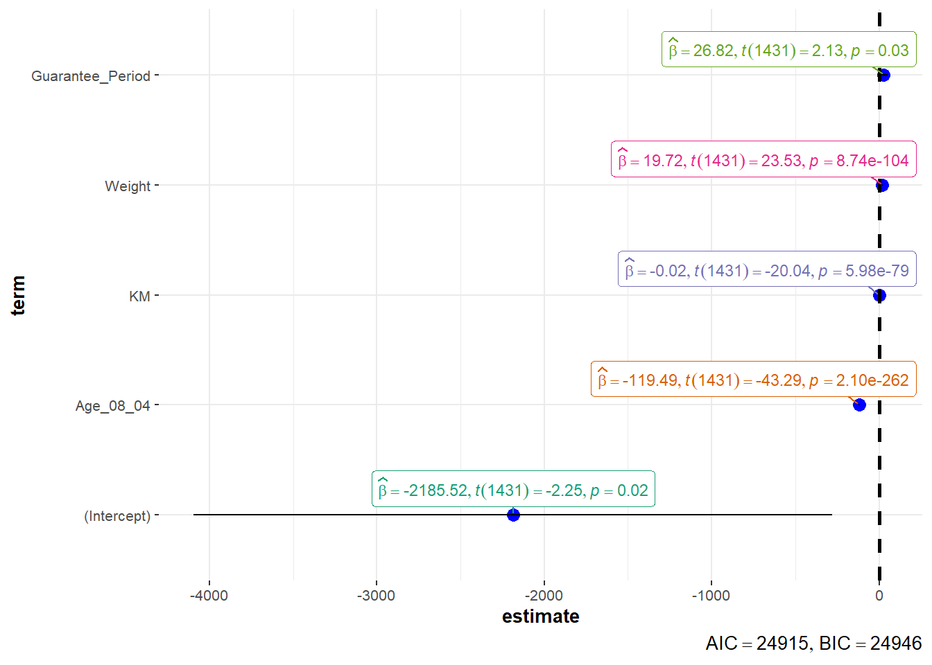
Visualize uncertainty of point estimates
point estimate such as mean, addressed with uncertainty like CI se: standard error measures the variability of the sample means, estimate the precision of the sample mean as an estimate of the population mean.
sd/sqrt(n-1), n-1 can been thought as degree of freedom
sum_num <- exam_data %>%
  group_by(RACE) %>%
  summarise(n=n(),
            mean=round(mean(MATHS),2),
            sd=round(sd(MATHS),2)) %>%
  mutate(se=round(sd/sqrt(n-1),2))

sum_num
# A tibble: 4 × 5
RACE n mean sd se
<chr> <int> <dbl> <dbl> <dbl>
1 Chinese 193 76.5 15.7 1.13
2 Indian 12 60.7 23.4 7.04
3 Malay 108 57.4 21.1 2.04
4 Others 9 69.7 10.7 3.79knitr::kable(head(sum_num),format='html')| RACE | n | mean | sd | se |
|---|---|---|---|---|
| Chinese | 193 | 76.51 | 15.69 | 1.13 |
| Indian | 12 | 60.67 | 23.35 | 7.04 |
| Malay | 108 | 57.44 | 21.13 | 2.04 |
| Others | 9 | 69.67 | 10.72 | 3.79 |
Standard error visulization
ggplot(sum_num)+
  geom_errorbar(
    aes(x=RACE,
        ymin=mean-se,
        ymax=mean+se),
    width=0.2,
    color='black',
    alpha=0.9,
    size=1)+
  geom_point(aes(x=RACE,
                 y=mean),
             stat='identity',
             color='red',
             size=2,
             alpha=1)+
  ggtitle("Standard error of mean
          maths score by race")
95% Confidence interval
use qnorm(0.975)=1.96 to calculate lower and upper bound
sum_num$RACE <- factor(sum_num$RACE,levels = sum_num$RACE[order(-sum_num$mean)])
ggplot(sum_num)+
  geom_errorbar(
    aes(x=RACE,
        ymin=mean-1.96*se,
        ymax=mean+1.96*se),
    width=0.2,
    color='black',
    alpha=0.95,
    size=1)+
  geom_point(aes(x=RACE,
                 y=mean),
             stat='identity',
             color='red',
             size=2,
             alpha=1)+
  ggtitle("95% confidence interval of mean maths score by race")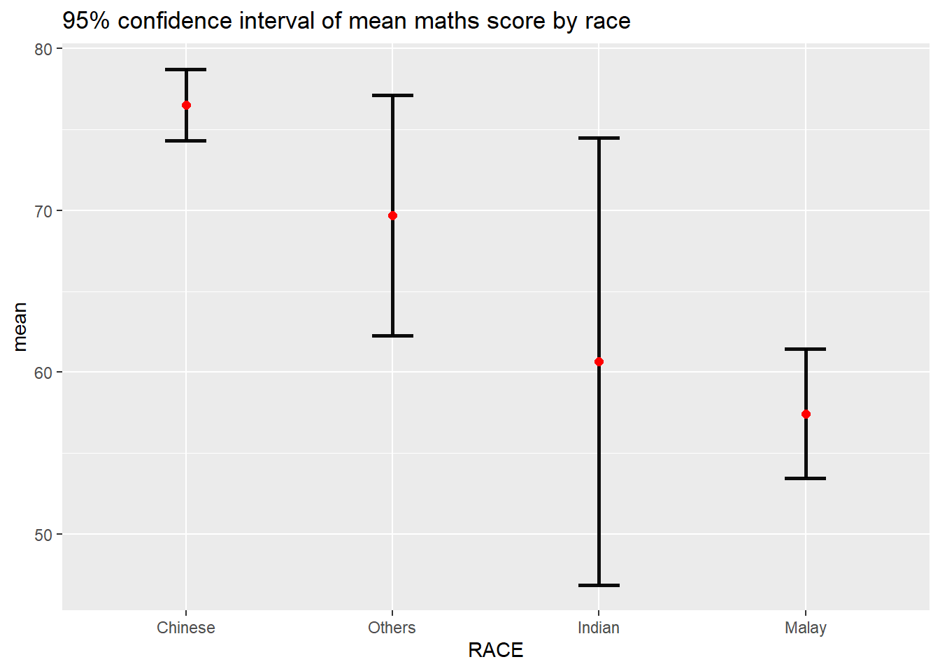
Uncertainty of point estimates with interactive error bars
data <- highlight_key(sum_num)
p <- ggplot(data)+
  geom_errorbar(
    aes(x=RACE,
        ymin=mean-2.32*se,
        ymax=mean+2.32*se),
    width=0.2,
    color='black',
    alpha=0.99,
    size=1)+
  geom_point(aes(x=RACE,
                 y=mean),
             stat='identity',
             color='red',
             size=2,
             alpha=1)+
  ggtitle("99% confidence interval of mean maths score by race")

gg <- highlight(ggplotly(p),"plotly_selected")

crosstalk::bscols(gg,DT::datatable(data),widths = 5)
Confidence interval plot with ggdist
exam_data %>%
  ggplot(aes(x=RACE,y=MATHS,))+
  stat_pointinterval()+
  labs(
    title="Visualising confidence intervals of mean math score",
    subtitle = "Mean Point + Confidence-interval plot")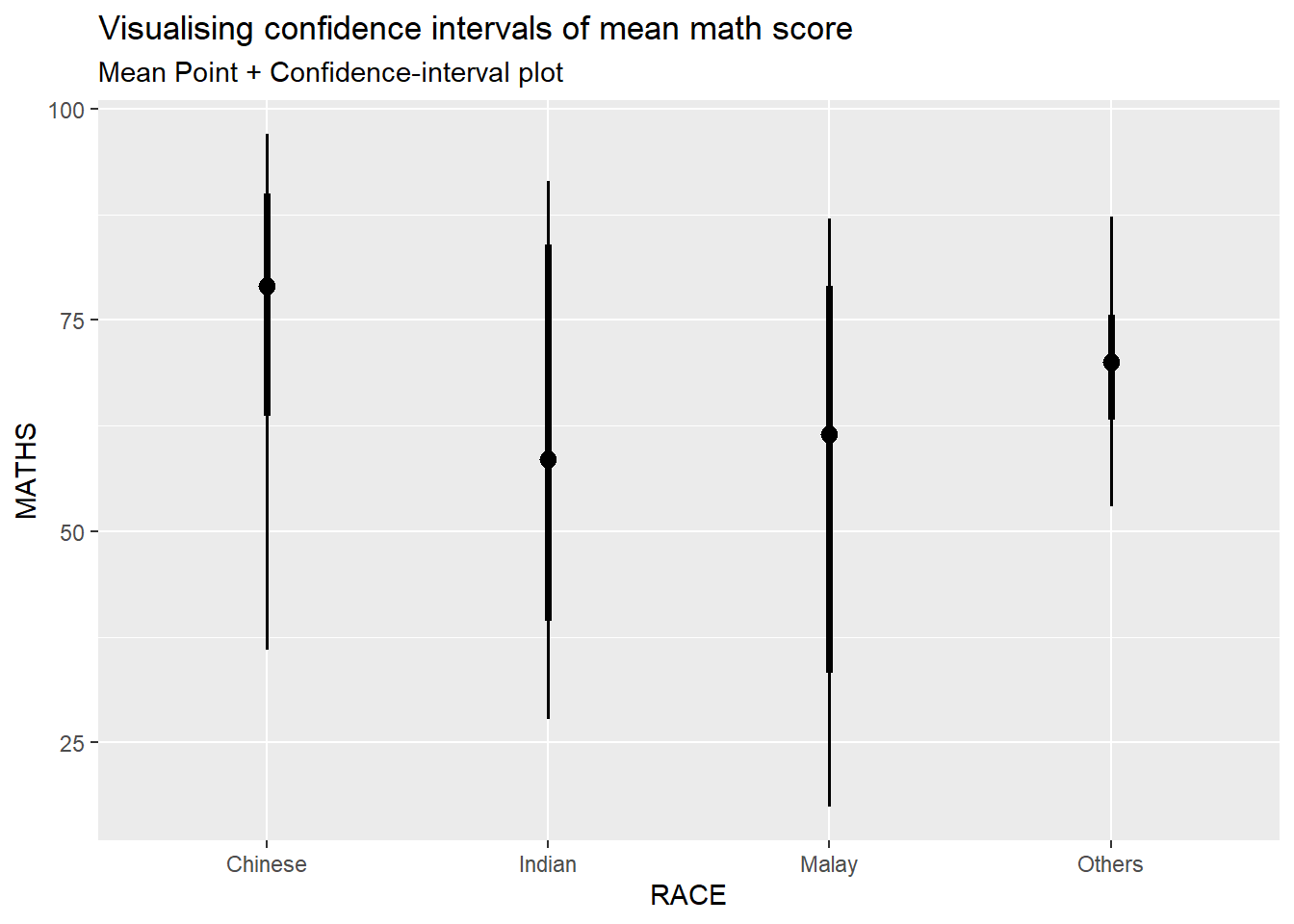
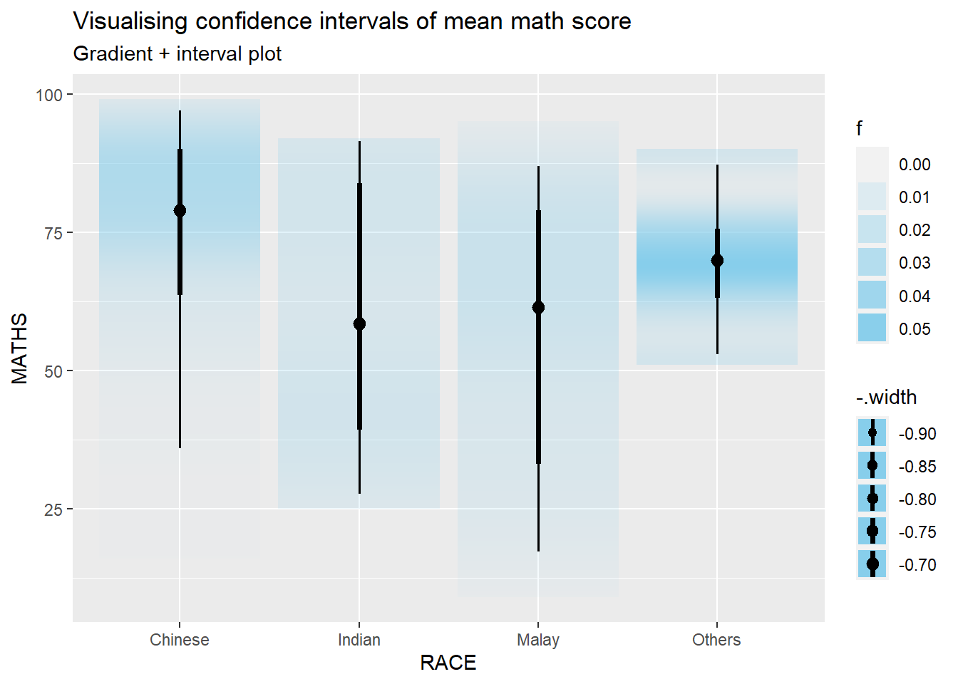
Use stat_gradientinterval
exam_data %>%
  ggplot(aes(x = RACE,
             y = MATHS)) +
  stat_gradientinterval(
    fill='skyblue',
    show.legend=TRUE
  )+
  labs(
    title = "Visualising confidence intervals of mean math score",
    subtitle = "Gradient + interval plot"
  )
Hypothetical Outcome Plots
library(ungeviz)Sample 25 data each time, and plot horizontal line grouping by race.
ggplot(data=exam_data,
       aes(x=factor(RACE),y=MATHS))+
  geom_point(position=position_jitter(),size=0.5)+
  geom_hpline(data=sampler(25,group = RACE),color = "#D55E00",size=0.1)+
  theme_bw()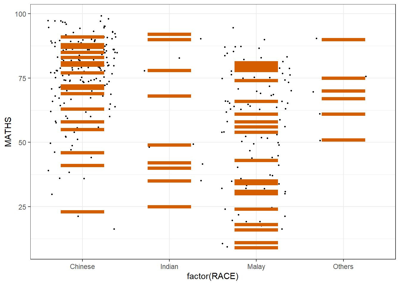
Transition_states means create sequence of frames to have animation of changes
Draw indicating generating a column of sampling, starting with first frame to the twentieth frame
ggplot(data=exam_data,
       aes(x=factor(RACE),y=MATHS))+
  geom_point(position=position_jitter(),size=0.5)+
  geom_hpline(data=sampler(25,group = RACE),color = "#D55E00",size=0.1)+
  theme_bw()+
  transition_states(.draw,1,20)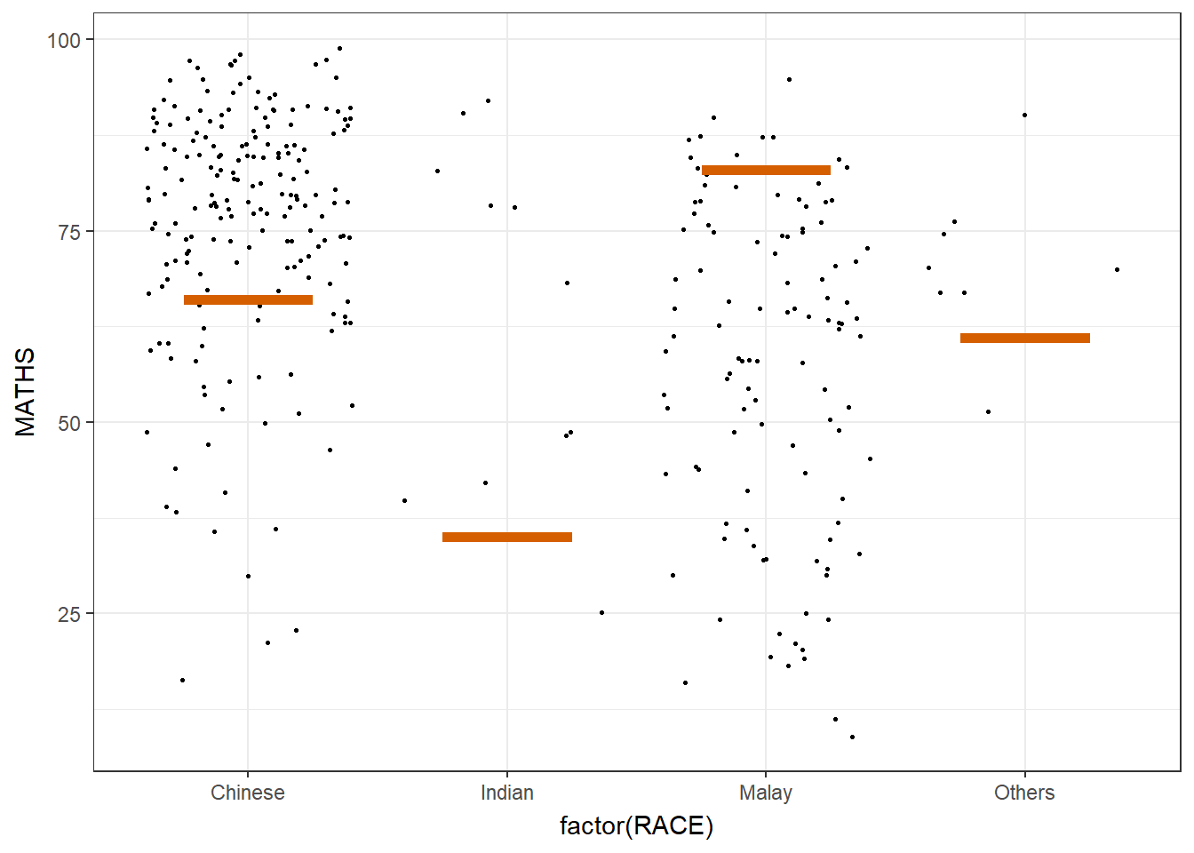
exam_data# A tibble: 322 × 7
ID CLASS GENDER RACE ENGLISH MATHS SCIENCE
<chr> <chr> <chr> <chr> <dbl> <dbl> <dbl>
1 Student321 3I Male Malay 21 9 15
2 Student305 3I Female Malay 24 22 16
3 Student289 3H Male Chinese 26 16 16
4 Student227 3F Male Chinese 27 77 31
5 Student318 3I Male Malay 27 11 25
6 Student306 3I Female Malay 31 16 16
7 Student313 3I Male Chinese 31 21 25
8 Student316 3I Male Malay 31 18 27
9 Student312 3I Male Malay 33 19 15
10 Student297 3H Male Indian 34 49 37
# ℹ 312 more rowsFunnel Plots for Fair Comparisons
pacman::p_load(tidyverse, FunnelPlotR, plotly, knitr)covid19 <- read_csv("data/COVID-19_DKI_Jakarta.csv") %>%
mutate_if(is.character,as.factor)
covid19# A tibble: 267 × 7
`Sub-district ID` City District `Sub-district` Positive Recovered Death
<dbl> <fct> <fct> <fct> <dbl> <dbl> <dbl>
1 3172051003 JAKARTA U… PADEMAN… ANCOL 1776 1691 26
2 3173041007 JAKARTA B… TAMBORA ANGKE 1783 1720 29
3 3175041005 JAKARTA T… KRAMAT … BALE KAMBANG 2049 1964 31
4 3175031003 JAKARTA T… JATINEG… BALI MESTER 827 797 13
5 3175101006 JAKARTA T… CIPAYUNG BAMBU APUS 2866 2792 27
6 3174031002 JAKARTA S… MAMPANG… BANGKA 1828 1757 26
7 3175051002 JAKARTA T… PASAR R… BARU 2541 2433 37
8 3175041004 JAKARTA T… KRAMAT … BATU AMPAR 3608 3445 68
9 3171071002 JAKARTA P… TANAH A… BENDUNGAN HIL… 2012 1937 38
10 3175031002 JAKARTA T… JATINEG… BIDARA CINA 2900 2773 52
# ℹ 257 more rowsPR: proportional ratio, indicates that the data represents the ratio of the numerator (deaths) to the denominator (positive cases) for each sub-district
funnel_plot(numerator = covid19$Death,denominator = covid19$Positive,
            group=covid19$`Sub-district`,
            data_type = "PR",
            x_range = c(0,6500),
            y_range=c(0,0.05),
            label=NA,
            title = "COVID-19 Fatality Rate by Positive Cases",
            x_label="Cumulative COVID-19 Positive Cases",
            y_label="Cumulative Fatality Rate"
            )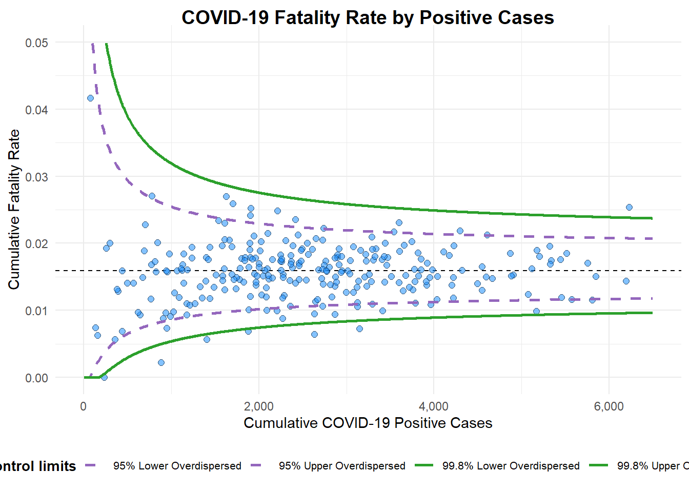
A funnel plot object with 267 points of which 7 are outliers.
Plot is adjusted for overdispersion.
Customnized funnel plot
Standard error formula for probability: √ [p (1-p) / n)
Use reciprocal and square so bigger standard error can have bigger weight in the weighted mean
seq function generates a sequence of number from 1 to maximum value of positive, incremental by 1, so that can count confidence interval of different sample size
Show code
df <- covid19 %>%
  mutate(rate=Death/Positive) %>%
  mutate(rate.se=sqrt(rate*(1-rate)/Positive)) %>%
  filter(rate>0)

fit.mean <- weighted.mean(df$rate,1/(df$rate.se^2))

number <- seq(1,max(df$Positive),1)
upper.95 <- fit.mean+1.96*sqrt(fit.mean*(1-fit.mean)/number)
lower.95 <- fit.mean-1.96*sqrt(fit.mean*(1-fit.mean)/number)
upper.99 <- fit.mean+3.29*sqrt(fit.mean*(1-fit.mean)/number)
lower.99 <- fit.mean-3.29*sqrt(fit.mean*(1-fit.mean)/number)
table <- data.frame(upper.95,lower.95,upper.99,lower.99,number,fit.mean)

p <-ggplot(df,aes(x=Positive,y=rate))+
  geom_point(aes(label=(label=`Sub-district`),alpha=0.4))+
  geom_line(data=table,aes(x=number,y=upper.95),size = 0.4,
            colour = "grey40",
            linetype = "dashed")+
  geom_line(data=table,aes(x=number,y=lower.95),size = 0.4,
            colour = "grey40",
            linetype = "dashed")+
  geom_line(data=table,aes(x=number,y=upper.99),size = 0.4,
            colour = "grey40",
            linetype = "dashed")+
   geom_line(data=table,aes(x=number,y=lower.99),size = 0.4,
            colour = "grey40",
            linetype = "dashed")+
  geom_hline(data=table,aes(yintercept=fit.mean),size = 0.4,
             colour = "grey40")+
             coord_cartesian(ylim=c(0,0.05)) +
  annotate("text", x = 1, y = -0.13, label = "95%", size = 3, colour = "grey40") +
  annotate("text", x = 4.5, y = -0.18, label = "99%", size = 3, colour = "grey40") +
  ggtitle("Cumulative Fatality Rate by Cumulative Number of COVID-19 Cases") +
  xlab("Cumulative Number of COVID-19 Cases") +
  ylab("Cumulative Fatality Rate") +
  theme_light() +
  theme(plot.title = element_text(size=12),
        legend.position = c(0.91,0.85),
        legend.title = element_text(size=7),
        legend.text = element_text(size=7),
        legend.background = element_rect(colour = "grey60", linetype = "dotted"),
        legend.key.height = unit(0.3, "cm"))

p
Interactive plot
interative_p <-ggplotly(p,tooltip=c("label","x","y"))
interative_p